Here are some very important things that you need to take into consideration when coming up with a fitness logo, branding and marketing, here are our top tips;
The Brand
The first things that you need to establish when choosing how you want your fitness logo to look is to decide how you want people to perceive your company. Marketing begins with branding and how you come across to your audience is essential to helping build trust between you and the consumer.
The Name
Do you have a solid name for your brand yet? A common trend at the moment that many gyms and fitness centres have taken on are including either the name of the founder or initials of the founding team to create the brand name. This can add a bit of edge to the brand name and may even intrigue your audience.
The Mnemonic
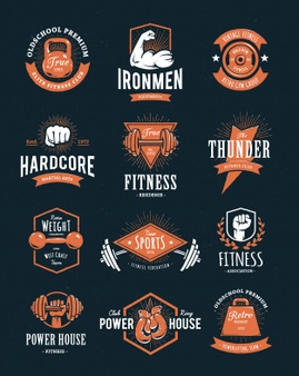
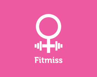
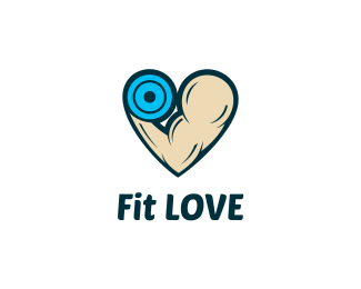
The mnemonic refers to an image that is used in a logo with is designed to aid memory. This doesn’t need to be exclusively an image; it could also be a pattern of text. The most common logos will include gym equipment or an image of an ‘ideal’ body type, however, recently logo designers have been focusing more on the text to introduce the mnemonic of the fitness logo.
The Uniqueness
The only way for you to stand out from your competitors is to be unique, so naturally, you are going to want to ensure that your logo stands out and sets you apart from the competition as well. Not only should your fitness logo stand out but something about the services you offer should also stand out. There are thousands of gyms across the UK, so finding diversity is key.
The Font
The font of a fitness logo is more important than you may think. Comic Sans is clearly not a great font to use for anything and unless you’re being ironic (which may not even come across) then it is best to avoid it.
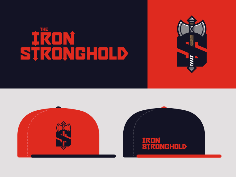
The Usage
When you are deciding on a fitness logo for your company one of the main things that you need to think about is the usage. Your logo should be used on all branding and merchandising. Logos can be edited to fit different needs, for example, you may have a main logo with an image and text, then you may have a slightly diluted version of the logo that only contain the mnemonic. An example of this is the McDonald’s logo, their logo is incorporated into the brand name McDonald’s, but they can also use the “M” on its own and it’s still recognised. This can be useful if you are trying to brand a product or promotion but don’t have a lot of space for the logo.